
If you write emails, essays, recipes, or blog posts, you deal with fonts and typography.
Typography is everywhere around you. If you are reading a text, any text, it has a font. Despite this, I think most people don’t give typography too much thought. I’d like for this post to be your super quick (less than 5 minutes) introduction to the basics of the trade.
I’ll give you a brief explanation of the foundations and some tips you can apply to just about anything, then give you links to further material if you want to go deeper. I won’t go down rabbit holes, and I won’t use super technical terms.
Serif v Sans-serif
Typefaces can be divided into many a different category, but two are particularly big: serif and sans-serif.
Serifs are these little red ‘ornaments’ on the ends:

If you see a font with those elements, that’s likely a serif. This font is a serif, for example. Fonts that look more “blocky” are usually sans-serifs (that is, literally, without-serifs), like this one:

Generally speaking, serifs are considered more readable for long periods of time and at smaller sizes. This is why they are preferred for long form content such as books. Sans-serifs, on the other hand, are often used in titles, headings, and the like, since they can be more easily read at large sizes and have more of an impact. Not for nothing, Impact is a sans-serif typeface.
There are many other categories, but I said no rabbit holes, so I’ll leave it at that.
Nah, ok, just a couple more. This is a script, or handwriting typeface. You can easily guess why:
And these are monospaced, or fixed width fonts, called so because each glyph (that is, characters and punctuation) takes up exactly the same amount of horizontal space. Remember typewriters?

See how squished the “W” and how wide the “I” are? That’s fixed width fonts for you.
Font Weight
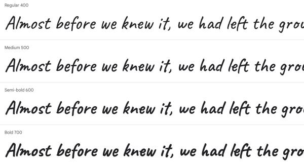
Sometimes you’ll see a number next to a font’s name, like “400” and “700.” That’s the font’s weight, basically, how “thick” it is.
Generally, a number like 100 indicates a very light font, 300 a regular one, 700 a bold one, and 900 a seriously bold one. There are no strict rules though, so one typeface’s 700 might be slightly different from the next.
If you want to see what that looks like visually, here it is.
Font Pairings
Fonts are like food. Some go well together, others don’t. The question then is: which ones are a match? This topic could cover an entire book (and it does,) but here’s a general, golden rule of typography: pair a serif font with a sans-serif font. Kind of like what I’m doing on this website.
Of course there are exceptions, etcetera etcetera. But this rule is enough to get you going in the right direction. Pick a sans-serif typeface for your headings and a serif one for your main text. You can’t really go terribly wrong with that.
If you really don’t like serifs, then, do two sans-serif fonts, but make sure headings are clearly, visually distinguishable from the rest. Why? Because of the hierarchy.
The Hierarchy
You might have seen images like this one online:
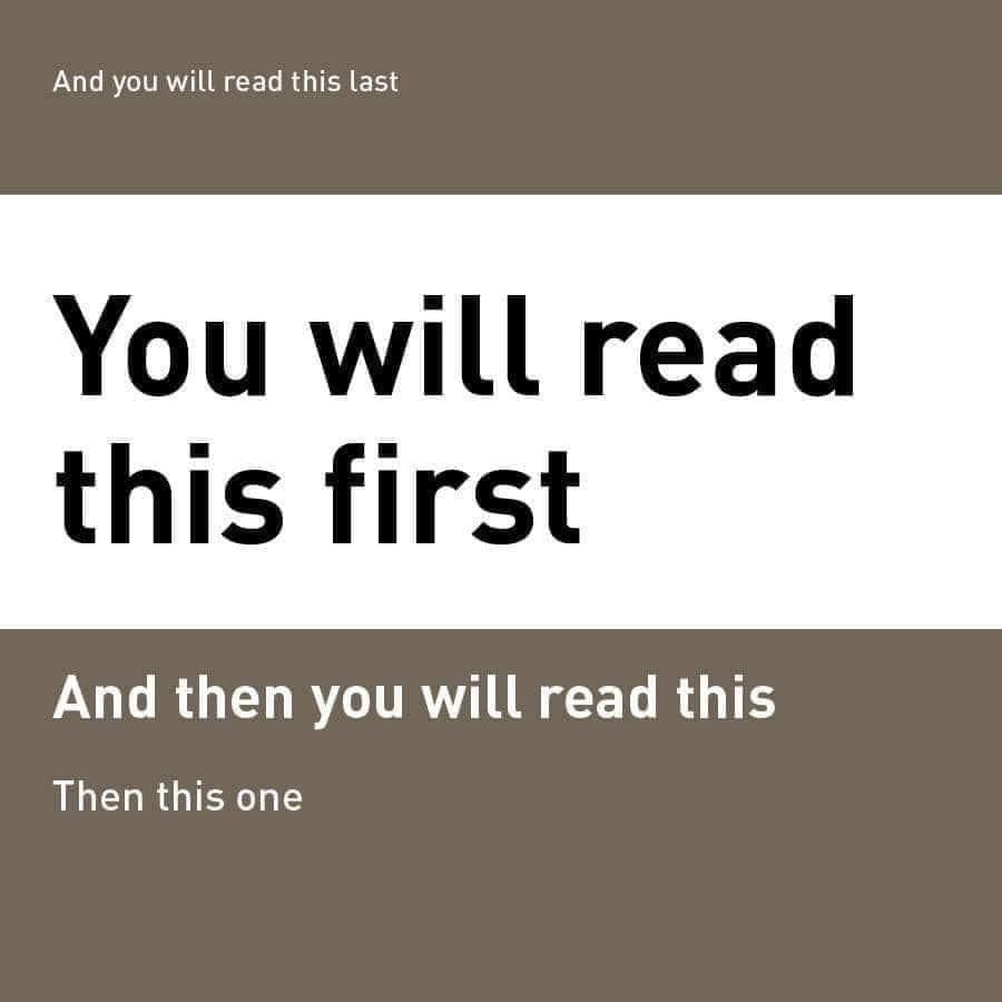
The biggest and heaviest font is the one immediately drawing the eye, followed up by the smaller ones. Roughly speaking that’s the hierarchy. Positioning on the page also matters, but that’s another topic.
When we pick fonts, we are quite literally telling the reader where to place their eyes. That’s a big responsibility. In your visual work, make sure there is a clear hierarchy: people want to get to the most important information immediately, and they want to skim around the text scanning the headings. Let them do that by clearly making some parts bigger than the rest. This is why the golden rule usually works.
Text Alignment
You know you can align your text to the left, the center, and the right. You also know you can do what’s called “justification” and make the text go all the way from one end of the page to the other, without leaving any space around. So when should we use each?
You’ll find most long content is justified, like so:

The text looks nice and compact, and every line starts and ends on the same spot. Well of course, the book on typography is supposed to look good.
Normally, for long texts, I’d tell you to always go justified. The problem is that most modern software (Docs, Word, WordPress) does justification really poorly. By that I mean, when you fully justify text on your computer, there are gigantic, unnatural spaces between words. This is mostly because they have no idea how to break words up to hyphenate them:

Give justification a try in your setup. If it looks good, great. If it creates large spaces around words, go for left alignment, like this blog. It looks good enough, and certainly better than leaving giant gaps between words.
Extras
Is Comic Sans really that bad?
Nah. There’s not much wrong with the typeface per se, the reason people complain about it is because it’s misused. Comic Sans is supposed to be fun, yet you’ll see people use it in official documents and, ehum, funeral homes?
Anyway, if you are looking for a better alternative to Comic Sans, but still retaining the same spirit, you can take a look at Comic Neue.
Are there things I can do to make life easier for people with poor eyesight or other disabilities?
Accessibility in typography is a steadily growing field. Just a little ago the Braille Institute released a new typeface designed to be easy to read for people with poor vision.
For people with dyslexia, you’ll see “dyslexia fonts” online, but studies have shown that they don’t actually help. Instead, the British Dyslexia Association recommends using Arial and, yes, Comic Sans.
In general though, the two best tips are to keep font sizes generous and to make sure there’s enough contrast between the text and the background.
What are some quick punctuation and formatting rules?
One space after commas, periods, colons, semicolons, and pretty much any other punctuation mark. Hyphens (-) between words like ice-cream, en-dashes (–) to denote a range (1990–1993) and em-dashes to make a nice break in your sentence—just like this.
What’s the difference between a font and a typeface?
A typeface is a grouping of fonts with the same style. For example, “Times New Roman” is a typeface, but Times New Roman 18pt Bold is a font.

These above are all the same typeface but each line is a different font. It’s not that crucial though.
More Reading
Want more? There’s more.
- Butterick’s Practical Typography is the next logical step from here. Free, online book covering everything you need to know about typography.
- If you want to drink straight from the fire hydrant, you can go for Bringhurst’s Elements of Typographic Style. It’s actually a pleasant read.
- Keith Houston’s Shady Characters blog is informative, quirky, and got me into this whole thing in the first place.